Chess Poster Design Process
I will explore the design process for the first poster (above) I designed for the chess club. The club runs every Monday and uses my family’s takeaway as the venue. This is inspired by other chess clubs that are dotted all across London, such as CsCb in Brixton.
In terms of experience, I am an amateur who has dabbled in random projects here and there. I have used Canva to create posters of Warwick Esports society (Example 1 and Example 2) and recently have picked up Figma to flesh out UI/UX for my start-up.
Design Evolution
Design 1 v1 was not good… it lacked clear visual direction. The font was not engaging as only size and colour were utilised to create differences. Without a clear hierarchy, the information was given in one big ‘splat’.
Whilst the design was not good, I believe my vision for it was unique. I intended to use line drawings of chess pieces with circles placed along the path of the line. This would imitate the diagrammatic TfL tube map designed by Harry Beck. This idea was based on the venue’s proximity to a tube station. To complement this theme, I also used the TfL colour scheme. This was not inherently bad, but the decision of where to place the colour had no logic or reasoning behind it. I think it would be worth revisiting this concept with a better-suited image in the middle, though (I was lazy and just browsed stock images).
Design 1 v2 veers away from the symmetrical system of laying out information to a transitional system. This builds upon the arrangement of v1’s title. I was introduced to the idea of ‘systems’ in the book Typographic Systems by Kimberly Elam. I highly recommend this book, as it presents 8 typographic systems with simple graphic diagrams, studies where various designers demonstrate the system, and real-world examples. The series of studies are particularly useful as each design displays the same information whilst keeping the font, size and weighting consistent to demonstrate the legibility of each system.
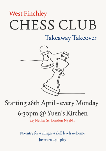
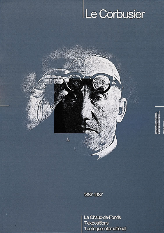
Design 2’s ideas will ultimately become the final design, and I was heavily inspired by the examples (real-world and studies) in Typographic Systems by Kimberly Elam. Within the first chapter, Axial System, the striking poster 'Le Corbusier' by Werner Jeker. Seeing the use of transparency to create a square focus in the middle made me immediately think of a chess square. The poster ingrained the motif for my designs going forward.
Within the book, the axial and grid system studies demonstrated effective usage of transparent non-objective elements to create rhythm and emphasis. The concept of rhythm within the graphical design context is very interesting to me. ‘Movement’ and ‘flow’ are not words you commonly associate with stagnant graphics on a piece of paper. But the book made me realise that my subconscious willingness to be attentive to graphics is correlated to a mastery of rhythm. I particularly enjoyed the use of overlapping transparent objects to create different shades that can emphasise areas of your poster. This aspect heavily influences the direction of my designs.
The last big inspiration was the Swiss grid system design. I started with Grid Systems by Josef Müller-Brockmann. This book has been suggested by various guides on learning web design, and I finally decided to sit down and read it. As Design 2 consisted of rows and columns, it was not hard to implement the teachings. One idea I became very conscious of was that the functionality of your work will dictate the design and its dimensions. Printed materials are often read at a distance of 30-35cm away, therefore, the font selection must be legible in this range. Also, the idea is that people exert energy to stay in line when reading a long piece of horizontal text. Designers should ease their work by restricting each line to ~7 words as an empirical rule and using adequate vertical line spacing. These concepts helped brush up the readability of my designs.
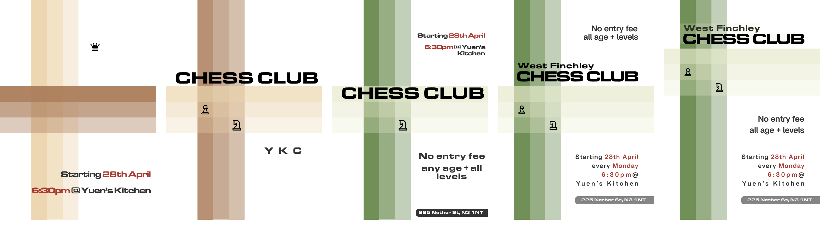
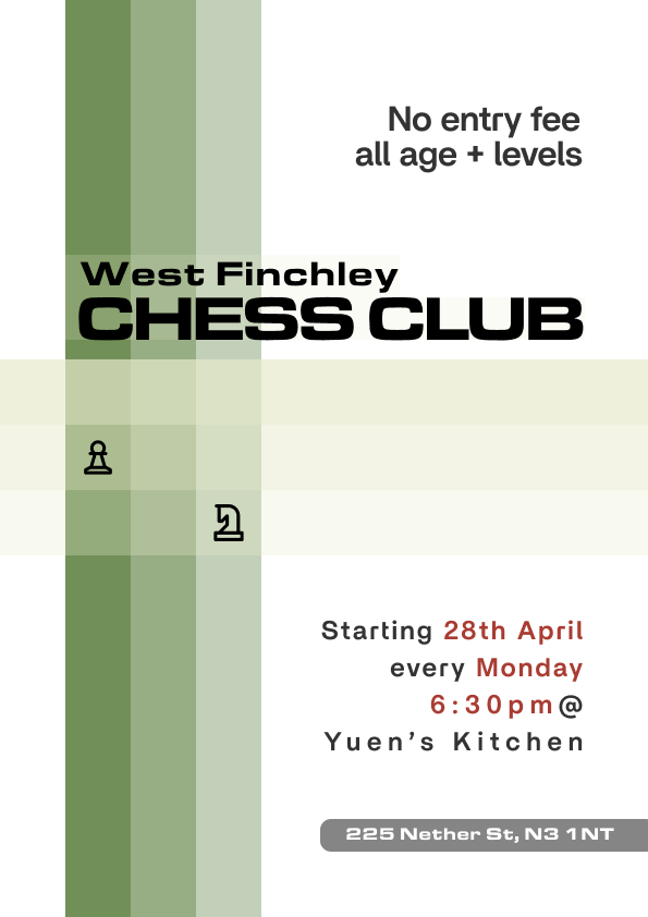
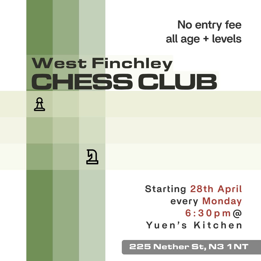
Above are some iterations of designs I went through. For each change, I focused on ensuring legibility, clarity of the message and maintaining the hierarchy. The components I tinkered around with are:
-> Transparency and layering of each band. The darker vertical bands are placed behind the lighter bands because they create the clearest 3x3 grid.
-> Colour - the two colour schemes I played around with were brown (AB7E5B and ECD5AE) and green (6A8A4F and E7EACB), taken from lichess.com and chess.com, respectively. To create a hierarchy for the text that carried key information, the brick red from Design 1 v2 was used. Ultimately, green was chosen as my co-founder, Isaac, thought green is the colour of chess, and he also ordered green boards.
-> Secondary font to create a hierarchy between the title and information. ChatGPT suggested Futura Now and Britti Sans as good options. Britti Sans was chosen because Futura Now looked too similar to Eurostile Extended.
Writing this piece has made me reflect and appreciate the design process. I was initially reluctant to redesign the first one as I thought it was ‘good enough’. Holding myself accountable to a certain standard and being inspired helped me get to the final design. At the time, it felt bad to redesign as the time and effort would be wasted. In hindsight, even small aspects such as the brick red from Design 1 made their way to the end. I’m enjoying doing design work a lot and I hope you follow me along this journey.